TERRA FERTILE
A VISUAL SYNTHESIS OF A DYNAMIC REALITY
What we did
Strategy
Brand Identity
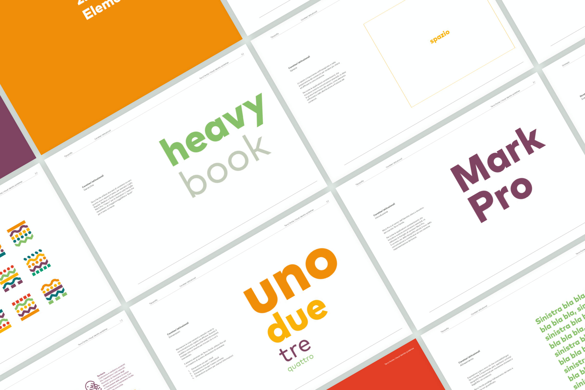
Brand Guidelines
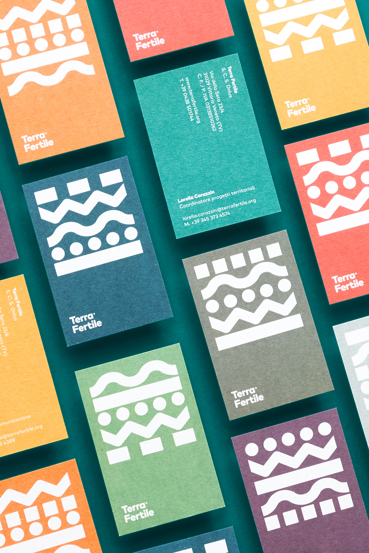
Corporate identity
Digital strategies & Social Media
Website Design & Development
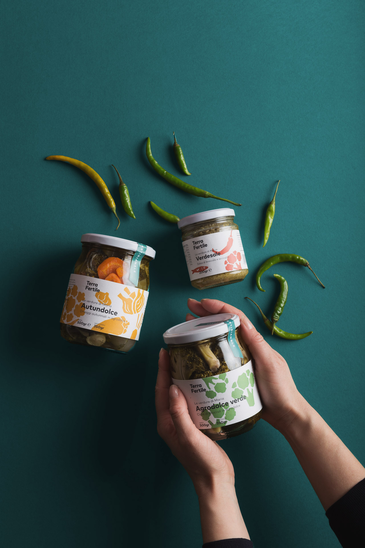
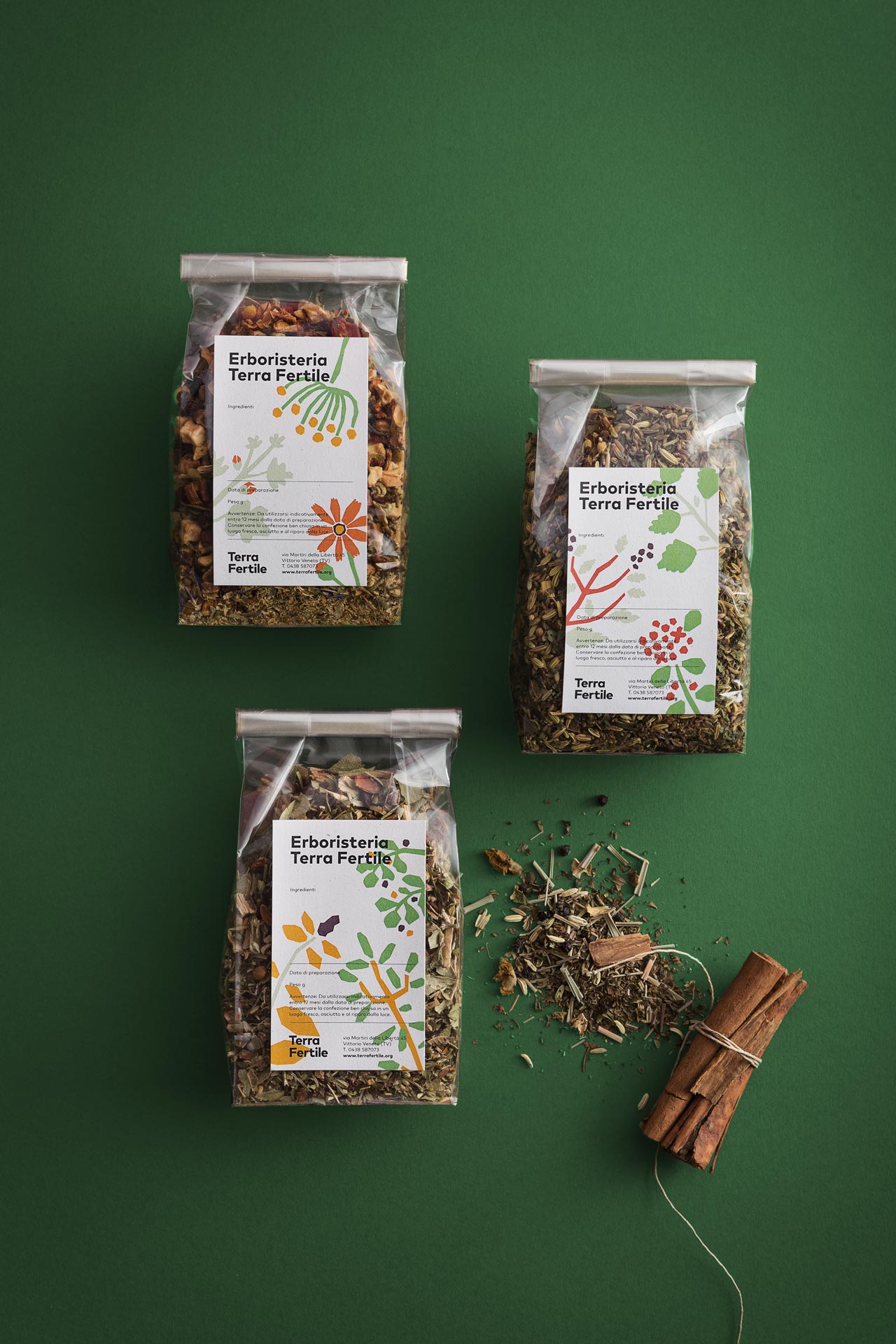
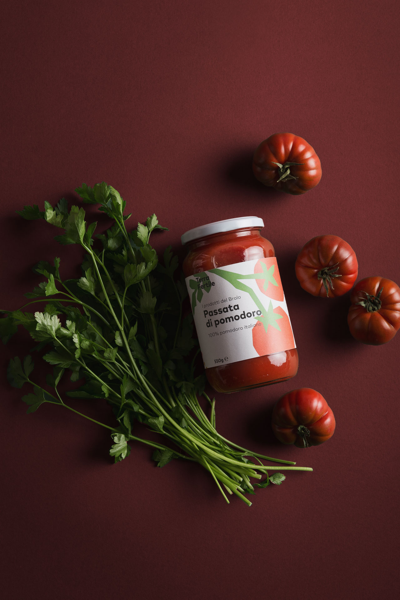
Terra Fertile is a social cooperative that operates in the field of civil economy and personal services while upholding the values of inclusion and solidarity. In order to clarify the different areas that Terra Fertile works in, we reorganised the cooperative’s services by applying an essential process of rationalization.
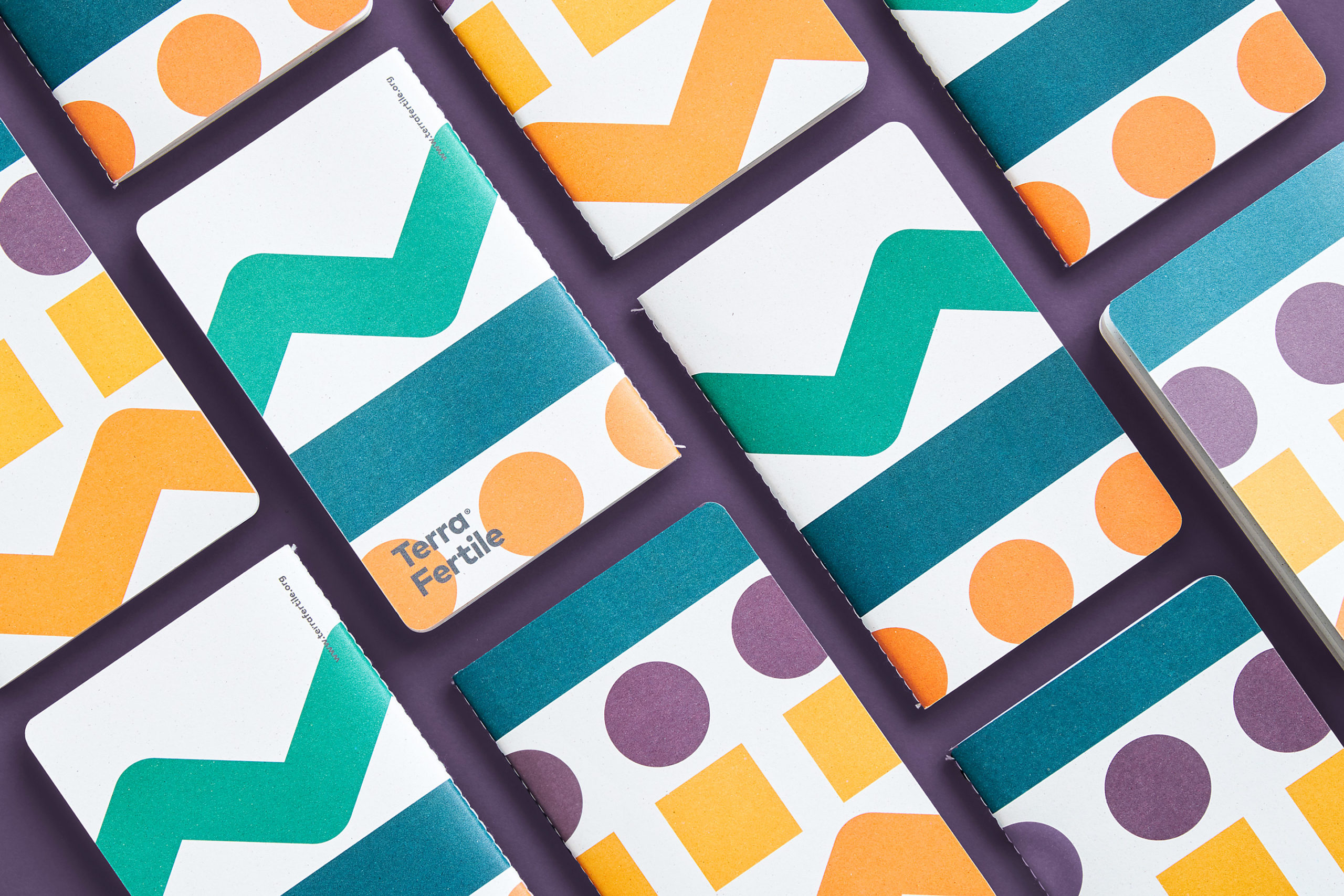
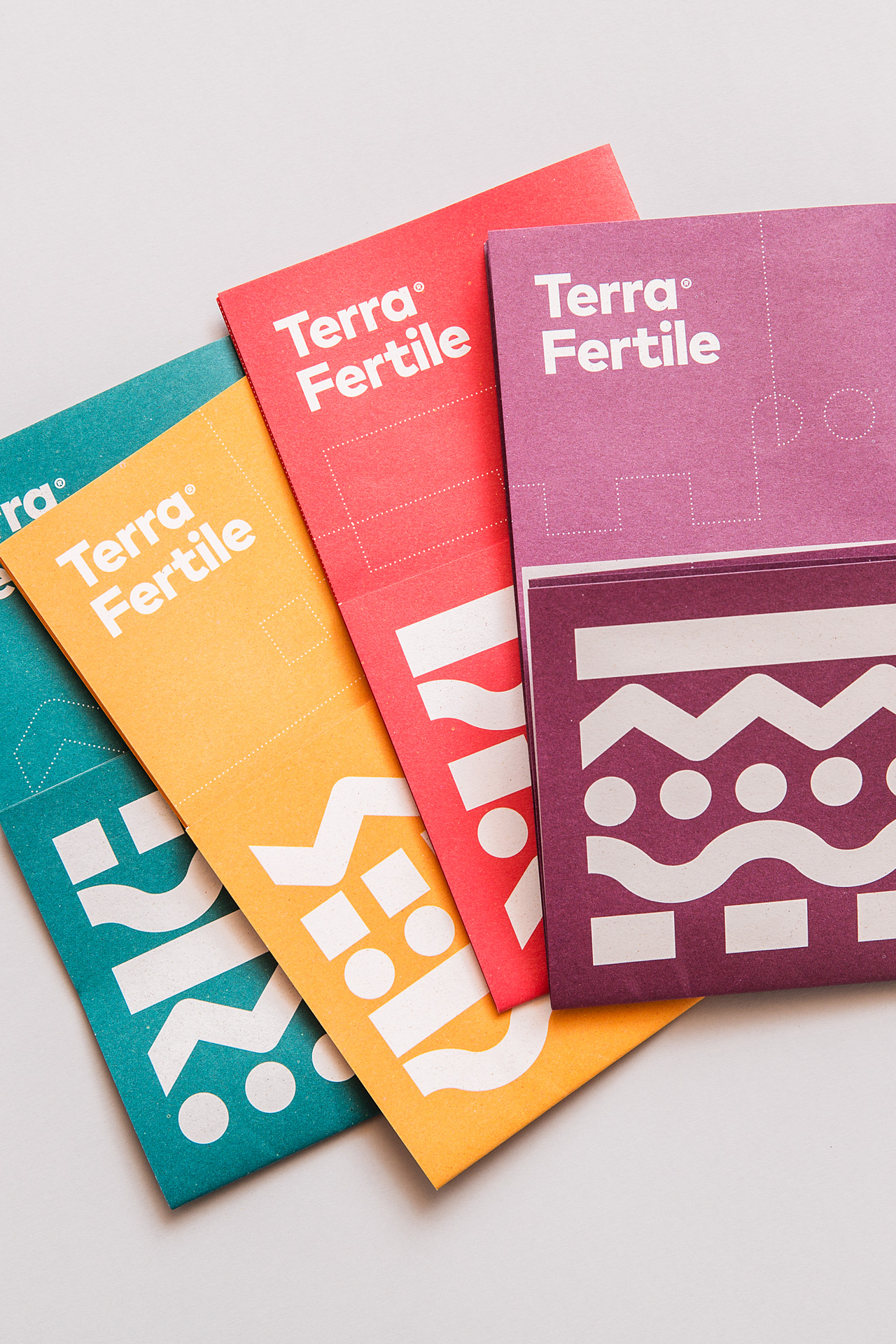
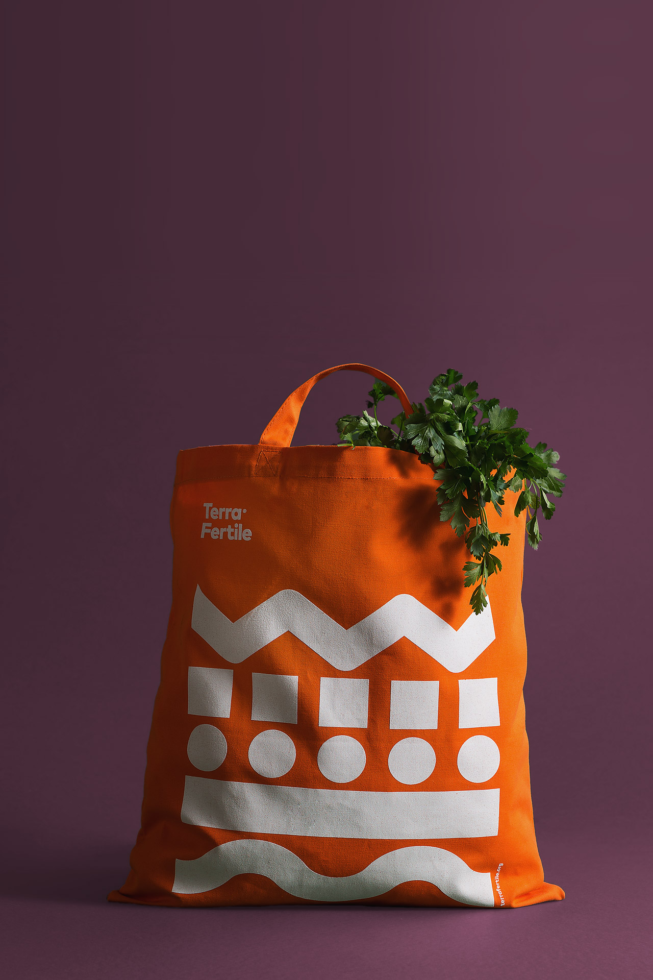
Based on the semiotic analysis of the sectors in which it operates, we came up with a simple, easy-to-remember five-word tagline. Each word represents a scenario that groups together the cooperative’s activities. The resulting brand is based on a five-line pictogram of different colours and shapes that correspond to different scenarios as well as layers of soil, representing the earth's fertility.
This fresh, simple, and immediate coordinated image communicates empathy, and thereby promotes Terra Fertile's involvement with the local area and its community.
In the same way, reimagining the site from a user point of view has not only placed the public at the centre of this experience, but has improved the website's ease of use.
www

TERRA FERTILE’S REBRANDING COMMUNICATES THE VALUES OF A DYNAMIC REALITY THROUGH A SIMPLE AND INTUITIVE VISUAL SYNTHESIS
VISIT US IN VIA G. CASONI, 3 IN VITTORIO VENETO (TV) ITALY
CONTACT US VIA EMAIL OR GIVE US A CALL (+39) 0438 1845019
FOLLOW US ON INSTAGRAM, PINTEREST OR LINKEDIN
OTTONE STUDIO
VIA G. CASONI, 3
V. VENETO (TV) ITALY
INFO@OTTONESTUDIO.COM
(+39)0438 1845019
INSTAGRAM
PINTEREST
LINKEDIN
©2013-2026, Ottone Studio Subscribe to our Newsletter